


Mobile Updates to the Blog!
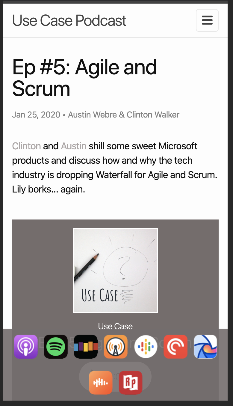
So recently, I finally got around to fixing the last couple of podcast platforms we had yet to join. It was at this point that I realized this site was missing something huge: links to our episodes on every platform! So I took some time to add links with brand images to the top nav, at which point I proudly message Clinton to get what I assumed would be resounding praise. Instead I got, “hmmm… they look too small.”
Not what I was looking for.
So I made them as big as I could while maintaining some sense of hierarchy, but apparently they were still too small. It was at this point that I realized he was on his phone.
This is where the rabbit hole begins. I start looking over the site on mobile and realize a couple of things. For one, Clinton was right, on desktop the icons looked perfect but on a phone, they were hard to make out and even harder to click with any precision. The second thing I noticed was that our embedded player had completely broken the page on mobile. Now most people probably would’ve stayed focused on the problem at hand, but to me the web player was a bigger issue.
So I started down the path of replacing our player.
A Quick Side Quest
Now most podcast distributors have their own embedded player. Anchor (our distributor) does, but it’s the one that we’ve previously discussed. It’s a really sleek looking player, but it’s just not mobile friendly, period. So I began my research and there are so many open source podcast web players… for Wordpress. After digging through all the Wordpress and Drupal plugins, I came across PodLove’s Webplayer. It’s everything we needed - open source, mobile responsive, highly configurable, and served from a CDN.
Now, the documentation was lacking some (as so much open source documentation is), but after dabbling with the settings for a little while, I had all the information we wanted in a test player on one of the episode pages. From there, it was a matter of pulling out the epsisode specific settings (episode titles, duration, etc) into Jekyll’s per page yaml settings, called “front matter” for reasons unknown to me.
Since PodLove’s Web Player takes a json object for its configuration and liquid variables can be used within javascript, I came up with the following <script> in the post template:
<script>
    //TODO: consolidate this and the other player in home.html
    podlovePlayer('#player', {
        title: "{{ page.title }}",
        poster: "https://s3-us-west-2.amazonaws.com/anchor-generated-image-bank/production/podcast_uploaded_nologo400/2033092/2033092-1563131762814-1cd3d271f5ebe.jpg",
        show: {
            title: "Use Case",
            subtitle: "Developers making a podcast about development!",
            poster: "https://s3-us-west-2.amazonaws.com/anchor-generated-image-bank/production/podcast_uploaded_nologo400/2033092/2033092-1563131762814-1cd3d271f5ebe.jpg",
            url: "https://usecasepod.github.io/"
        },
        duration: "{{ page.player_config.runtime }}",
        audio: [{
            url: "{{ page.player_config.audio_src }}",
            mimeType: 'audio/mp4'
        }],
        theme: {
            main: '#756C6C'
        },
        visibleComponents: [
            'showTitle',
            'episodeTitle',
            'progressbar',
            'controlSteppers',
            'poster',
            'tabAudio',
            'tabShare'
        ]
    });
</script>
Using these variables, now all thats required for each player to work is the following “front matter”:
---
title: "Ep #5: Agile and Scrum"
player_config:
    id: 5
    audio_src: https://anchor.fm/s/cb6d710/podcast/play/9930289/https%3A%2F%2Fd3ctxlq1ktw2nl.cloudfront.net%2Fstaging%2F2020-01-25%2F7ac66aff6ec57cc4fd212865a567082e.m4a
    runtime: "01:04:56"
    show_player: true
---
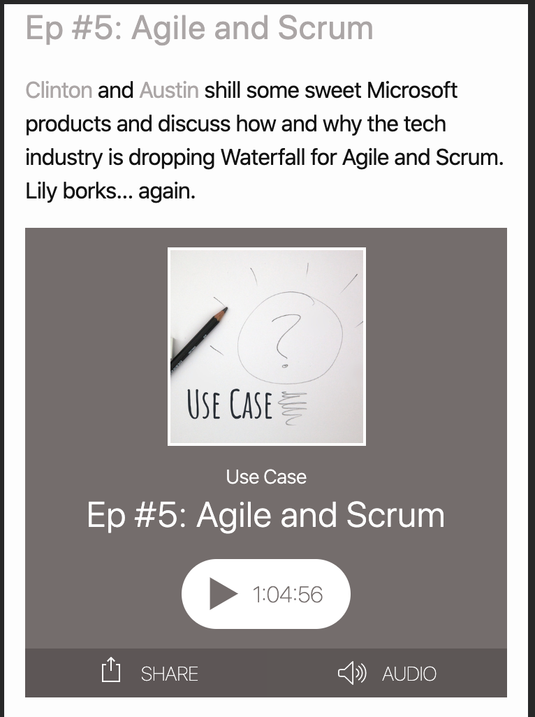
And the result is a beautiful, mobile responsive player, with media controls and a share button!
Now, you may have noticed the TODO in that script tag. I could’ve removed it and pretended that I created some Jekyll include with that tag so that there’s no duplication, but… I’d rather not lie to you. There are some small differences from the home page to the posts page, and I was just excited to see the player working so nicely. So, for now, copy and paste is my friend, and the player code will remain slightly duplicated until another day.
Now, On To The Main Quest
With the page no longer completely broken on mobile, and with my spirits riding high from the resounding success that is our new web player, I revisted the problem at hand: making our distribution links more mobile friendly.
My first instinct was to just make the icons significantly larger on mobile. This had two problems:
- There’s still this weird feeling of unbalance, as though the header and the links are fighting for attention.
- They’re still hard to tap.
Let’s take the second point first. At this point, they’re hard to tap not because they aren’t big enough, but instead because they’re in the top left corner, the hardest place for our fingers to reach on a mobile device. This lead to a decision that ultimately solved both these problems. While it did introduce some problems of its own, we’ll wait to address those at the end, because they themselves have solutions, which I hope to implement at a later date.
So what is this magic solution?
Move the links to the bottom of the viewport.
Yup. Revolutionary, I know. Using media queries, I created a bottom bar that would hold all the links on mobile at a legible and tappable size. Initially, I just used text alignment to center them, with wrapping text.
The sass looks something like this:
.title-links {
  margin-top: -5px;
  margin-bottom: 5px;
  & > .title-link-group {
    & > a {
      width: 25px;
      height: 25px;
      display: inline-block;
      margin-right: 5px;
  }
  @include tablet {
    position: fixed;
    bottom: 0;
    left: 0;
    margin: 0;
    padding: 10px 0 10px 0;
    text-align: center;
    width: 100%;
    background-color: rgba(117, 108, 108, 0.9);
    & > a {
        margin: 5px;
        width: 40px;
        height: 40px;
    }
  }
}
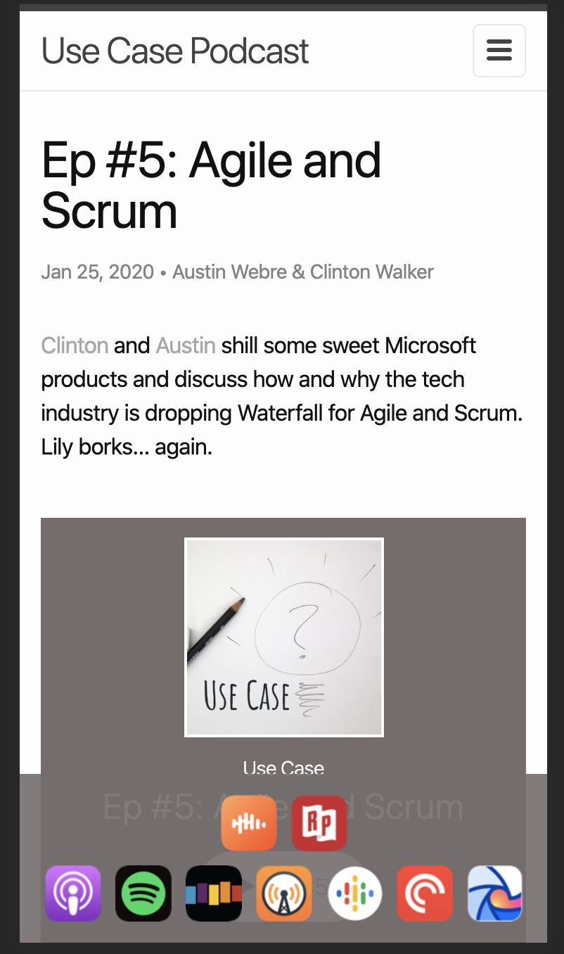
The result is something like this:
I liked this, it definitely allowed for an easier experience when tapping the icons and it gave enoughb space between the icons and the header, so they were no longer fighting for space. But it still felt weird and off balance. I decided to reverse the wrapping to see if that would help it feel more “anchored” to the bottom. It was at this point that I had to introduce some flexbox magic to get the wrapping to reverse.
.title-links {
  margin-top: -5px;
  margin-bottom: 5px;
  & > .title-link-group {
    & > a {
      width: 25px;
      height: 25px;
      display: inline-block;
      margin-right: 5px;
  }
  @include tablet {
    position: fixed;
    bottom: 0;
    left: 0;
    margin: 0;
    padding: 10px 0 10px 0;
    text-align: center;
    width: 100%;
    background-color: rgba(117, 108, 108, 0.9);
    display: flex;
    flex-wrap: wrap-reverse;
    & > a {
        flex: 1;
        margin: 5px;
        width: 40px;
        height: 40px;
    }
  }
}
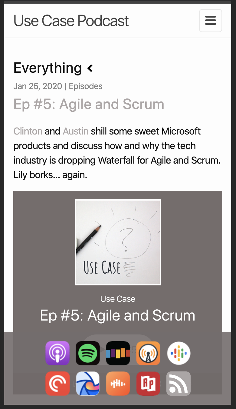
The result is something like this:
This does feel more anchored, and I sent it to Clinton, hoping once again that he would affirm that I had conquered this thing once and for all.
I had not.
We agreed that it felt more anchored, but we also agreed that it still felt a little unbalanced. He suggested a 4/5 distribution instead, which felt obvious to me as soon as he said it. Now, I won’t bore you with the details, but I did have to restructure the template to make this work. Specifically, I had to remove the templating of the link items as grouping them within liquid would be too much of a pain. I’m hoping in the future to think of a good way to template this out, but for the time being I hardcoded the links and created two groups.
On larger devices, these two groups would be displayed side by side as if they were one group. On smaller devices, the groups would break onto two lines. Each group would use flexbox styling to position iteslf and its contents.
.title-links {
  margin-top: -5px;
  margin-bottom: 5px;
  display: flex;
  & > .title-link-group {
    & > a {
      width: 25px;
      height: 25px;
      display: inline-block;
      margin-right: 5px;
      .rssfeed {
        width: 100%;
        height: 100%;
        margin-bottom: -8px;
        .button {
          stroke: none;
          fill: $brand-color;
        }
        .symbol {
          stroke: x none;
          fill: white;
        }
      }
    }
  }
  @include tablet {
    position: fixed;
    bottom: 0;
    left: 0;
    margin: 0;
    padding: 10px 0 10px 0;
    text-align: center;
    width: 100%;
    flex-wrap: wrap;
    background-color: rgba(117, 108, 108, 0.9);
    & > .title-link-group {
      display: flex;
      &:first-child {
        justify-content: flex-end;
      }
      &:last-child {
        justify-content: flex-start;
      }
      @include mobile {
        &:first-child,
        &:last-child {
          justify-content: center;
        }
      }
      flex: 1;
      & > a {
        margin: 5px;
        width: 40px;
        height: 40px;
      }
    }
  }
}
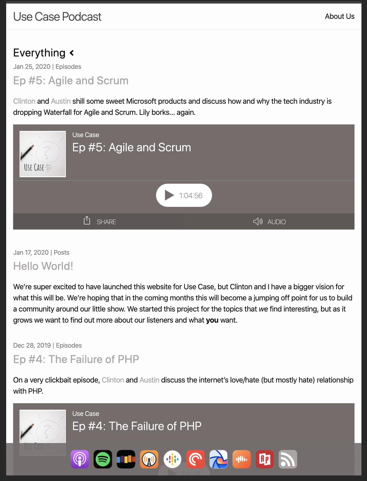
You’ll notice that the first group is given justify-content: flex-end and the second group is given justify-content: flex-start. This is to create the allusion of them being centered on tablet size devices where they will all fit. They are then centered on mobile. The result is this. (You’ll notice that there is now an even number of icons, because I added the RSS feed link as well.)
Now I mentioned that this method does have some drawbacks of its own. I personally think this is a really great solution for tablets, but on mobile, there’s the issue of just how much space this takes up on the screen. While I think this is better than not being able to tap them at all, it is a little annoying that so much real estate is constantly taken up by these. I think in the future I’ll turn this bottom bar into a drawer, that way it can be dismissed and recalled at will.
But there we are! I really enjoyed spending a little time thinking about mobile friendly design and applying this to our little podcast website.
Am I abusing css? Are my mobile instincts totally wrong? Have suggestions for improvements? Tell me in the comments below, send an email to usecasepod@gmail.com, or @ me on twitter.